


The quality of creatives you create for your business, can become a determining factor of the quality of service you can offer to your prospects and potential clients. But often, you see businesses make the same common mistakes with their designs.
In this article, we go through 9 mistakes you should absolutely avoid while working on graphic designs.
Inconsistent Design
Inconsistent design can immediately put off customers or potential clients from considering your services. Imagine a design filled with more colors than you can identify and fonts that remind you of a comic book your read during your childhood. would you consider opt-in in for services from a business if the design was such a mess?
Probably not, and that is why, being consistent is essential when working on graphic designs. When choosing colors palettes, keep yourself from using more than 5 colors at most, even if some of them are shades. A good choice is to keep it between two to three colors. Similarly, when it comes to font choice, keep it simple, its best to use one family of font in your creatives.
Poor Legibility
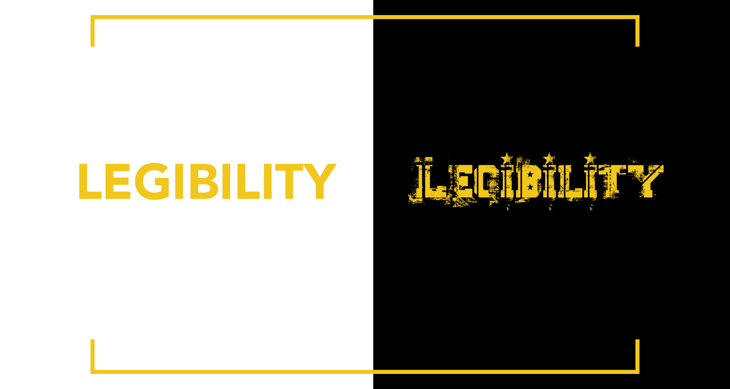
Apart from keeping the creative consistent, the choice of your font can also impact the legibility of the creative. Having clear consistent font on your creatives will allow people to clearly understand your message. Poor legibility is the number one reason why businesses start losing customers and clients, even after publishing creatives regularly. Ask yourself, would you spend more than 30 seconds on a creative that you cannot read?
Color Combinations

When choosing colors for your creatives, avoid combos that do not look well together. For example, black and white is the most common color combination that complement each other. While a parrot green and bright pink might not look as good. but don’t hesitate to experiment a little.
Bad Scaling
There is nothing worse than looking at a stretched-out image. Not only it looks terrible, but it also diminishes the chances of getting your message through. People would be busy discussing how bad the image appears, instead of reading what you wrote. Therefore, its best to avoid stretching your images. But if you have to, always maintain proportions.
Raster Images
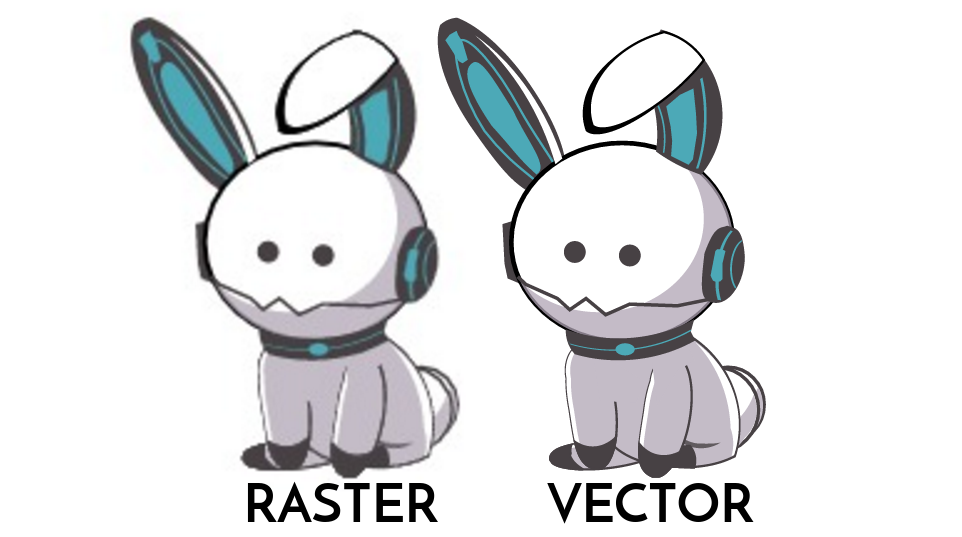
It is always best to avoid using raster or bitmap images when creating designs. Every time you stretch or shrink your raster image, you will have to deal with pixelation. There are two solutions to this issue; you either use higher resolution images with bigger sizes, since larger images stay crisp, even when you change the size. Or choose vector graphics instead.
Uneven Placement
Unless you are creating designs for fun, maintaining the alignment of various elements is extremely necessary. It will make your business look unprofessional if your creative contains randomly placed graphic or text elements. Further, your aim is to get your message through, but if your design is messy, people will only ignore it. This is another reason many businesses tend to miss out on potential clients.
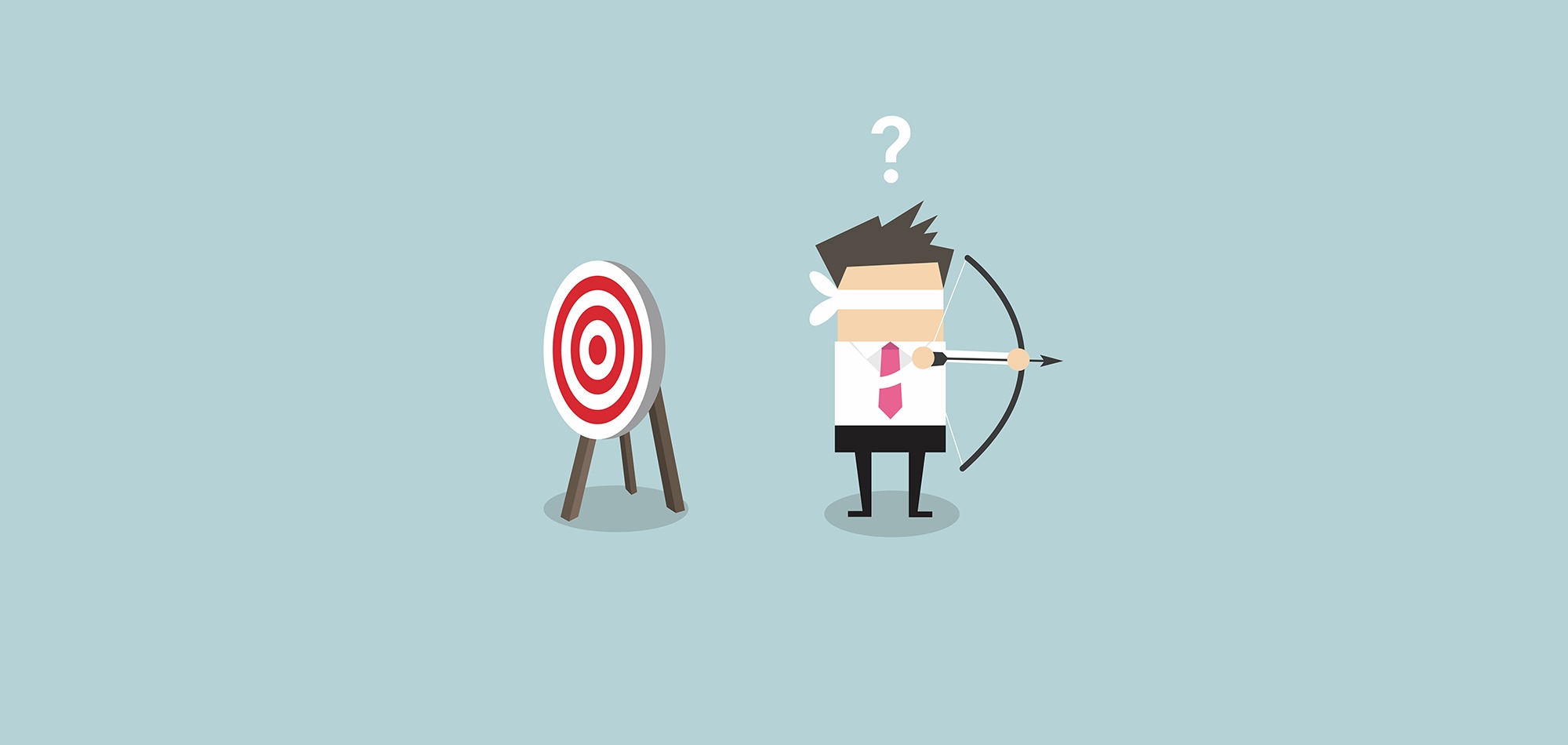
Bad Visual Hierarchy
Visual hierarchy plays an important role when trying to emphasize an element over others on your design. Carefully determine the right size and color for each item on your design to direct the viewer’s point of view.
Mistakes in Content
Even if you manage to create the best-looking design, if the content is bad or has basic mistakes, you will start losing customers instead of gaining new ones. Especially, if you are designing for a client, grammar mistakes or incorrect punctuation can damage your customer relationship. Always check your content, then double check it again.
Don’t Fill the Canvas
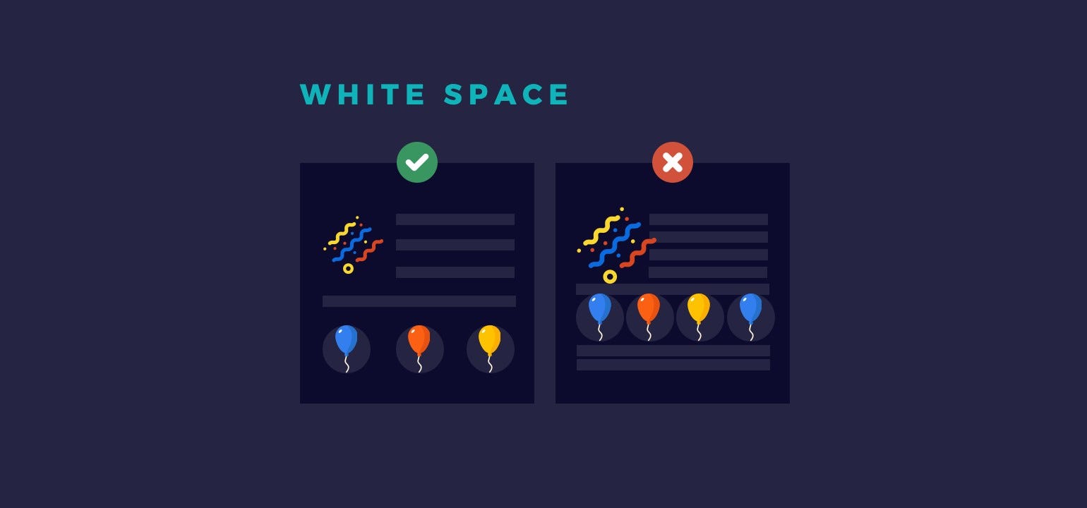
Sometimes, going with a minimal design can work much better than filling your whole creative with multiple elements. Consider leaving ample amount of whitespace in your creatives to give it a sophisticated look. The right amount of whitespace can help you appear more professional.


 ‘Yes’!- A Psychological Persuasion")